Material Stack Widget Tutorial
A widget that positions its children relative to the edges of its box.
Material Stack Widget useful inputs
-
alignment: How to align the non-positioned and partially-positioned children in the stack.
-
clipBehavior: The content will be clipped (or not) according to this option.
-
fit: How to size the non-positioned children in the stack.
-
textDirection: The text direction with which to resolve alignment.
-
children: The widgets below this widget in the tree.
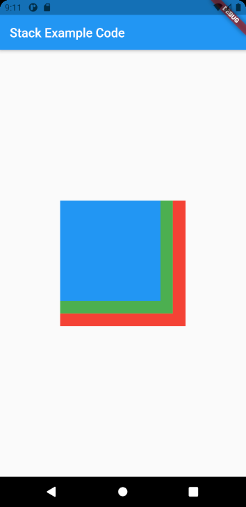
Material Stack Widget example
Stack(
  children: <Widget>[
    Container(
      width: 200,
      height: 200,
      color: Colors.red,
    ),
    Container(
      width: 180,
      height: 180,
      color: Colors.green,
    ),
    Container(
      width: 160,
      height: 160,
      color: Colors.blue,
    ),
  ],
)
Full codes example
import 'package:flutter/cupertino.dart';
import 'package:flutter/material.dart';

void main() => (runApp(StackExample()));

class StackExample extends StatelessWidget {
  @override
  Widget build(BuildContext context) {
    return MaterialApp(
      home: Scaffold(
        appBar: AppBar(
          title: const Text('Stack Example Code'),
        ),
        body: Container(
          alignment: Alignment.center,
          child: Stack(
            children: <Widget>[
              Container(
                width: 200,
                height: 200,
                color: Colors.red,
              ),
              Container(
                width: 180,
                height: 180,
                color: Colors.green,
              ),
              Container(
                width: 160,
                height: 160,
                color: Colors.blue,
              ),
            ],
          ),
        ),
      ),
    );
  }
}