Material BoxDecoration Widget Tutorial
An immutable description of how to paint a box.
-
The BoxDecoration class provides a variety of ways to draw a box.
-
The box has a border, a body, and may cast a boxShadow.
-
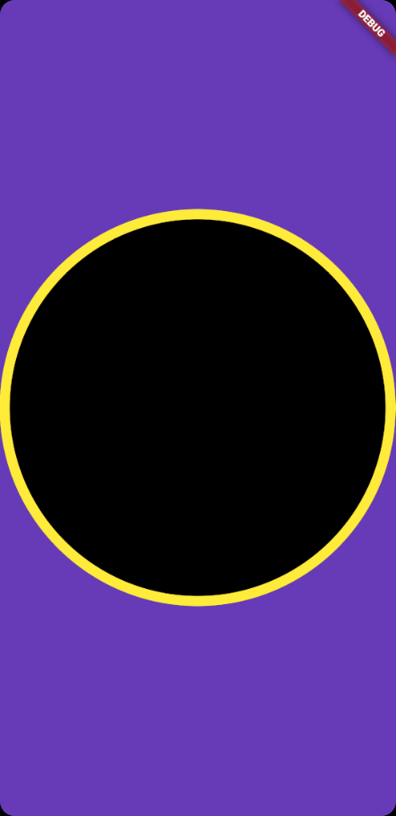
The shape of the box can be a circle or a rectangle. If it is a rectangle, then the borderRadius property controls the roundness of the corners.
Material BoxDecoration Widget useful inputs
Material BoxDecoration Widget example
BoxDecoration(
    shape: BoxShape.circle,
    color: Colors.black,
    border: Border.all(
      color: Colors.yellow,
      width: 10,
)
Full codes example
import 'package:flutter/cupertino.dart';
import 'package:flutter/material.dart';

void main() => (runApp(BoxDecorationExample()));

class BoxDecorationExample extends StatelessWidget {
  @override
  Widget build(BuildContext context) {
    return MaterialApp(
      color: Colors.deepPurple,
      home: Scaffold(
        appBar: AppBar(
          title: const Text('Box Decoration Example Code'),
        ),
        body: Container(
          decoration: BoxDecoration(
            shape: BoxShape.circle,
            color: Colors.black,
            border: Border.all(
              color: Colors.yellow,
              width: 10,
            ),
          ),
        ),
      ),
    );
  }
}