Flutter Material AlertDialog Widget Tutorial
An alert dialog informs the user about situations that require acknowledgement. An alert dialog has an optional title and an optional list of actions. The title is displayed above the content and the actions are displayed below the content.
Flutter Material AlertDialog Widget useful inputs
-
title: The (optional) title of the dialog is displayed in a large font at the top of the dialog.
-
content: The (optional) content of the dialog is displayed in the center of the dialog in a lighter font.
-
actions: The (optional) set of actions that are displayed at the bottom of the dialog.
Flutter Material AlertDialog Widget example
showDialog<String>(
context: context,
builder: (BuildContext context) => AlertDialog(
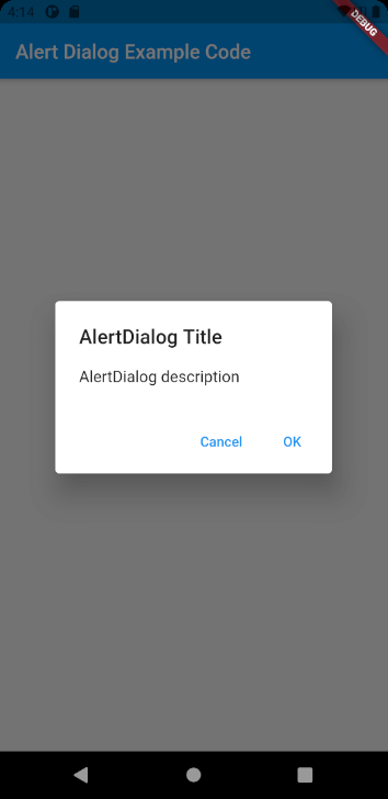
title: const Text('AlertDialog Title'),
content: const Text('AlertDialog description'),
actions: <Widget>[
TextButton(
onPressed: () => Navigator.pop(context, 'Cancel'),
child: const Text('Cancel'),
),
TextButton(
onPressed: () => Navigator.pop(context, 'OK'),
child: const Text('OK'),
),
],
),
)Full codes example
import 'package:flutter/material.dart';

void main() => (runApp(AlertDialogExample()));

class AlertDialogExample extends StatelessWidget {
  @override
  Widget build(BuildContext context) {
    return MaterialApp(
      home: Scaffold(
        appBar: AppBar(
          title: const Text('Alert Dialog Example Code'),
        ),
        body: Center(
          child: AlertDialogWidget(),
        ),
      ),
    );
  }
}

class AlertDialogWidget extends StatelessWidget {
  @override
  Widget build(BuildContext context) {
    return TextButton(
      onPressed: () => showDialog<String>(
        context: context,
        builder: (BuildContext context) => AlertDialog(
          title: const Text('AlertDialog Title'),
          content: const Text('AlertDialog description'),
          actions: <Widget>[
            TextButton(
              onPressed: () => Navigator.pop(context, 'Cancel'),
              child: const Text('Cancel'),
            ),
            TextButton(
              onPressed: () => Navigator.pop(context, 'OK'),
              child: const Text('OK'),
            ),
          ],
        ),
      ),
      child: const Text('Show Dialog'),
    );
  }
}