Flutter Material Card Widget Tutorial
A material design card: a panel with slightly rounded corners and an elevation shadow.
Flutter Material Card Widget useful inputs
-
borderOnForeground: Whether to paint the shape border in front of the child.
-
color: The color to paint the material. The Colors enum will apply here.
-
shadowColor: The color to paint the shadow below the card. The Colors enum will apply here.
-
margin: Empty space to surround the decoration and child. It describes by EdgeInsets
-
child: The widget below this widget in the tree.
Flutter Material Card Widget example
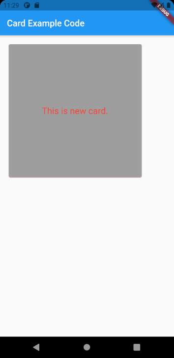
Card(
  borderOnForeground: true,
  color: Colors.grey,
  shadowColor: Colors.red,
  margin: EdgeInsets.all(20),
  child: SizedBox(
    height: 300,
    width: 300,
    child: Center(
      child: Text(
        'This is new card.',
        style: TextStyle(
          fontSize: 20,
          color: Colors.red,
        ),
      ),
    ),
  ),
)
Full codes example
import 'package:flutter/cupertino.dart';
import 'package:flutter/material.dart';

void main() => (runApp(CardExample()));

class CardExample extends StatelessWidget {
  @override
  Widget build(BuildContext context) {
    return MaterialApp(
      home: Scaffold(
        appBar: AppBar(
          title: const Text('Card Example Code'),
        ),
        body: Card(
          borderOnForeground: true,
          color: Colors.grey,
          shadowColor: Colors.red,
          margin: EdgeInsets.all(20),
          child: SizedBox(
            height: 300,
            width: 300,
            child: Center(
              child: Text(
                'This is new card.',
                style: TextStyle(
                  fontSize: 20,
                  color: Colors.red,
                ),
              ),
            ),
          ),
        ),
      ),
    );
  }
}