Bootstrap Commonly Used Component
Bootstrap offers a wide range of components, each serving different purposes. However, some components tend to be more commonly used due to their versatility and impact on user interfaces. Here are a few of the most useful and frequently utilized Bootstrap components
Bootstrap CSS Container Example Code
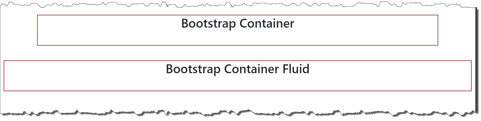
The container is a fundamental layout element that helps to manage and arrange content within a webpage. It required when using default grid system.
Bootstrap comes with three different containers:
-
.container : It sets a max-width at each responsive breakpoint.
-
.container-{breakpoint} : Which is width: 100% until the specified breakpoint
-
sm, md, lg, xl, xxl
-
-
.container-fluid : Which is width: 100% at all breakpoints
-
Documentation URL : https://getbootstrap.com/docs/5.3/layout/containers/
-
Container Code Snippet :
<div class="container">
    <div style="width: 100%; height: 100px; border: 2px solid maroon;">
        <h1 class="text-center">Bootstrap Container</h1>
    </div>
</div>

<div class="container-fluid">
    <div style="width: 100%; height: 100px; border: 2px solid maroon;">
        <h1 class="text-center">Bootstrap Container Fluid</h1>
    </div>
</div>-
Output :
Bootstrap CSS Card Example Code
-
Documentation URL : https://getbootstrap.com/docs/5.3/components/card/
-
Card Code Snippet :
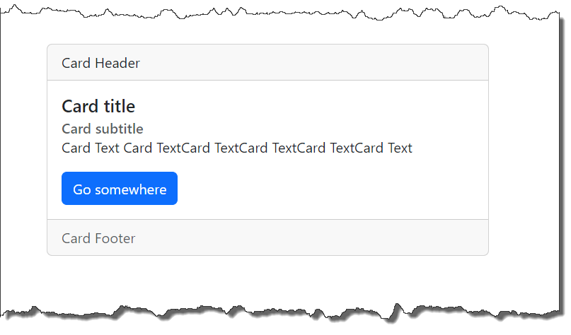
<div class="card">
    <div class="card-header">
        Card Header
    </div>

    <div class="card-body">
        <h5 class="card-title">Card title</h5>
        <h6 class="card-subtitle text-muted">Card subtitle</h6>
        <p class="card-text"> Card Text Card TextCard TextCard TextCard TextCard Text </p>
        <a href="#" class="btn btn-primary">Go somewhere</a>
    </div>

    <div class="card-footer text-muted">
        Card Footer
    </div>
</div>-
Output :
-
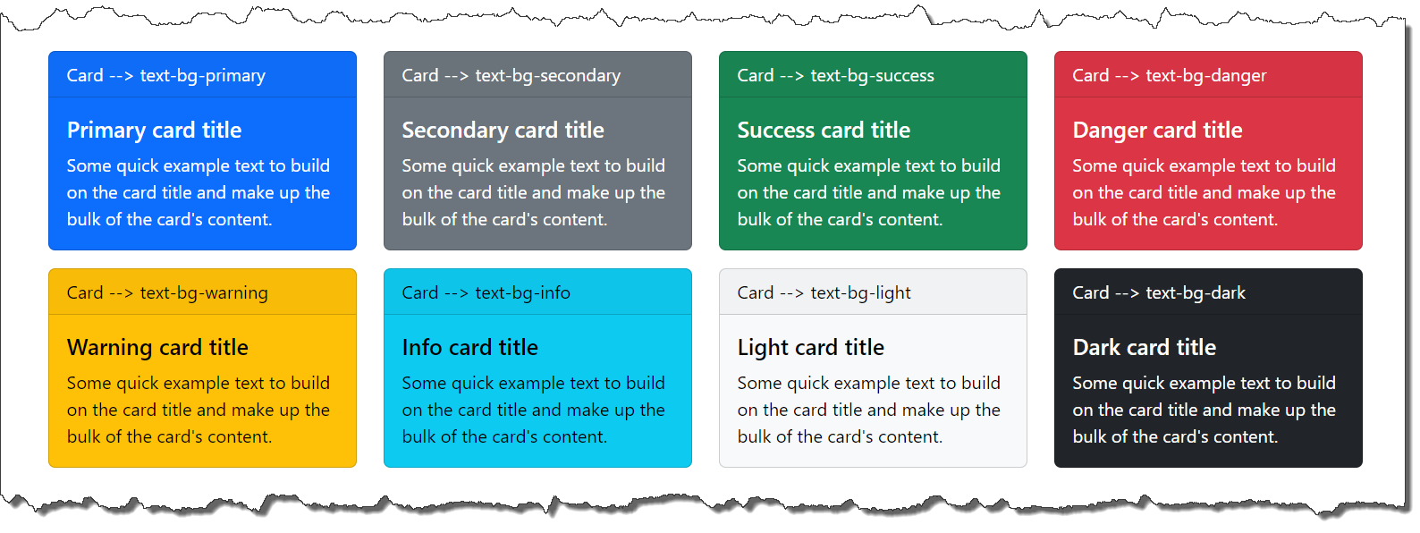
Various Card Color
-
text-bg-primary
-
text-bg-secondary
-
text-bg-success
-
text-bg-danger
-
text-bg-warning
-
text-bg-info
-
text-bg-light
-
text-bg-dark
-
-
Color Card Output