Bootstrap Table and Pagination
This section of bootstrap tutorial will show how to create various type of table and pagination using bootstrap.
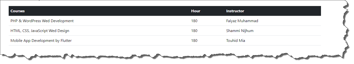
Bootstrap Simple Table
-
Documentation URL : https://getbootstrap.com/docs/5.3/content/tables/#overview
-
Code Snippet :
<table class="table">
    <thead>
    <tr>
        <th>Courses</th>
        <th>Hour</th>
        <th>Instructor</th>
    </tr>
    </thead>
    <tbody>
    <tr>
        <td>PHP & WordPress Wed Development</td>
        <td>180</td>
        <td>Faiyaz Muhammad</td>
    </tr>

    <tr>
        <td>HTML, CSS, JavaScript Wed Design</td>
        <td>180</td>
        <td>Shammi Nijhum</td>
    </tr>

    <tr>
        <td>Mobile App Development by Flutter</td>
        <td>180</td>
        <td>Touhid Mia</td>
    </tr>
    </tbody>
</table>-
Here
-
table : The table class is add design to table
-
-
Output :
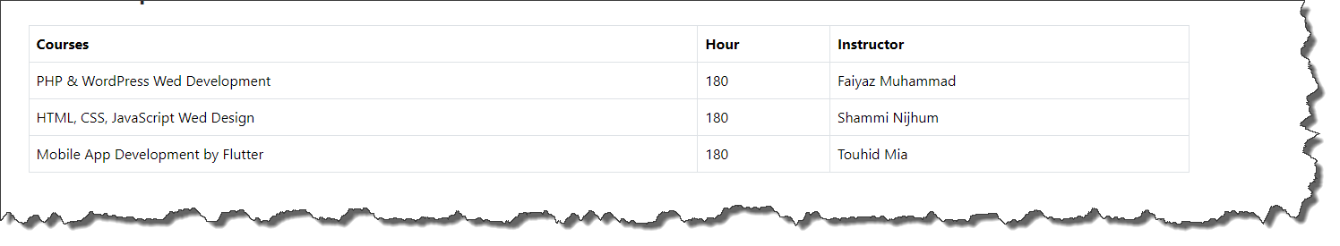
Bootstrap bordered table
-
Documentation URL : https://getbootstrap.com/docs/5.3/content/tables/#bordered-tables
-
Code Snippet :
<table class="table table-bordered">
    <thead>
    <tr>
        <th>Courses</th>
        <th>Hour</th>
        <th>Instructor</th>
    </tr>
    </thead>
    <tbody>
    <tr>
        <td>PHP & WordPress Wed Development</td>
        <td>180</td>
        <td>Faiyaz Muhammad</td>
    </tr>

    <tr>
        <td>HTML, CSS, JavaScript Wed Design</td>
        <td>180</td>
        <td>Shammi Nijhum</td>
    </tr>

    <tr>
        <td>Mobile App Development by Flutter</td>
        <td>180</td>
        <td>Touhid Mia</td>
    </tr>
    </tbody>
</table>-
Here
-
table-bordered : Used for create bordered in table
-
-
Output :
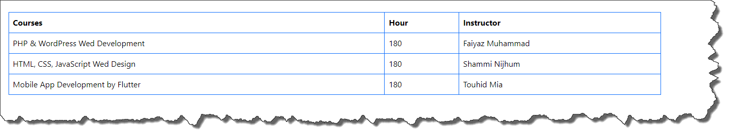
Bootstrap table with boarder color
-
Documentation URL : https://getbootstrap.com/docs/5.3/content/tables/#bordered-tables
-
Code Snippet :
<table class="table table-bordered border-primary">
    <thead>
    <tr>
        <th>Courses</th>
        <th>Hour</th>
        <th>Instructor</th>
    </tr>
    </thead>
    <tbody>
    <tr>
        <td>PHP & WordPress Wed Development</td>
        <td>180</td>
        <td>Faiyaz Muhammad</td>
    </tr>

    <tr>
        <td>HTML, CSS, JavaScript Wed Design</td>
        <td>180</td>
        <td>Shammi Nijhum</td>
    </tr>

    <tr>
        <td>Mobile App Development by Flutter</td>
        <td>180</td>
        <td>Touhid Mia</td>
    </tr>
    </tbody>
</table>-
Here
-
border-primary : Color variant. Boarder Color Details
-
-
Output :
Bootstrap table with dark head
-
Documentation URL : https://getbootstrap.com/docs/5.3/content/tables/#table-head
-
Code Snippet :
<table class="table">
    <thead class="table-dark">
    <tr>
        <th>Courses</th>
        <th>Hour</th>
        <th>Instructor</th>
    </tr>
    </thead>
    <tbody>
    <tr>
        <td>PHP & WordPress Wed Development</td>
        <td>180</td>
        <td>Faiyaz Muhammad</td>
    </tr>

    <tr>
        <td>HTML, CSS, JavaScript Wed Design</td>
        <td>180</td>
        <td>Shammi Nijhum</td>
    </tr>

    <tr>
        <td>Mobile App Development by Flutter</td>
        <td>180</td>
        <td>Touhid Mia</td>
    </tr>
    </tbody>
</table>-
Here
-
table-dark : For dark header
-
table-light : Light header default
-
-
Output :
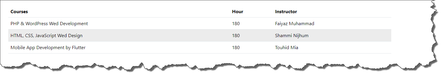
Bootstrap striped row table
-
Documentation URL : https://getbootstrap.com/docs/5.3/content/tables/#striped-rows
-
Code Snippet :
<table class="table table-striped">
    <thead>
    <tr>
        <th>Courses</th>
        <th>Hour</th>
        <th>Instructor</th>
    </tr>
    </thead>
    <tbody>
    <tr>
        <td>PHP & WordPress Wed Development</td>
        <td>180</td>
        <td>Faiyaz Muhammad</td>
    </tr>

    <tr>
        <td>HTML, CSS, JavaScript Wed Design</td>
        <td>180</td>
        <td>Shammi Nijhum</td>
    </tr>

    <tr>
        <td>Mobile App Development by Flutter</td>
        <td>180</td>
        <td>Touhid Mia</td>
    </tr>
    </tbody>
</table>-
Here
-
table-striped : It will add stripe on table row.
-
-
Output :
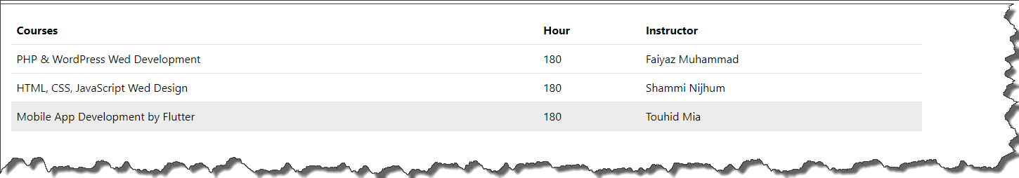
Bootstrap hover able rows table
-
Documentation URL : https://getbootstrap.com/docs/5.3/content/tables/#hoverable-rows
-
Code Snippet :
<table class="table table-hover">
    <thead>
    <tr>
        <th>Courses</th>
        <th>Hour</th>
        <th>Instructor</th>
    </tr>
    </thead>
    <tbody>
    <tr>
        <td>PHP & WordPress Wed Development</td>
        <td>180</td>
        <td>Faiyaz Muhammad</td>
    </tr>

    <tr>
        <td>HTML, CSS, JavaScript Wed Design</td>
        <td>180</td>
        <td>Shammi Nijhum</td>
    </tr>

    <tr>
        <td>Mobile App Development by Flutter</td>
        <td>180</td>
        <td>Touhid Mia</td>
    </tr>
    </tbody>
</table>-
Here
-
table-hover : Add mouse hover effect on table row
-
-
Output :
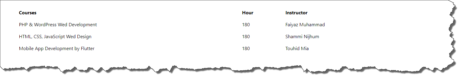
Bootstrap table without borders
-
Documentation URL : https://getbootstrap.com/docs/5.3/content/tables/#tables-without-borders
-
Code Snippet :
<table class="table table-borderless">
    <thead>
    <tr>
        <th>Courses</th>
        <th>Hour</th>
        <th>Instructor</th>
    </tr>
    </thead>
    <tbody>
    <tr>
        <td>PHP & WordPress Wed Development</td>
        <td>180</td>
        <td>Faiyaz Muhammad</td>
    </tr>

    <tr>
        <td>HTML, CSS, JavaScript Wed Design</td>
        <td>180</td>
        <td>Shammi Nijhum</td>
    </tr>

    <tr>
        <td>Mobile App Development by Flutter</td>
        <td>180</td>
        <td>Touhid Mia</td>
    </tr>
    </tbody>
</table>-
Here
-
table-borderless : Remove table border
-
-
Output :
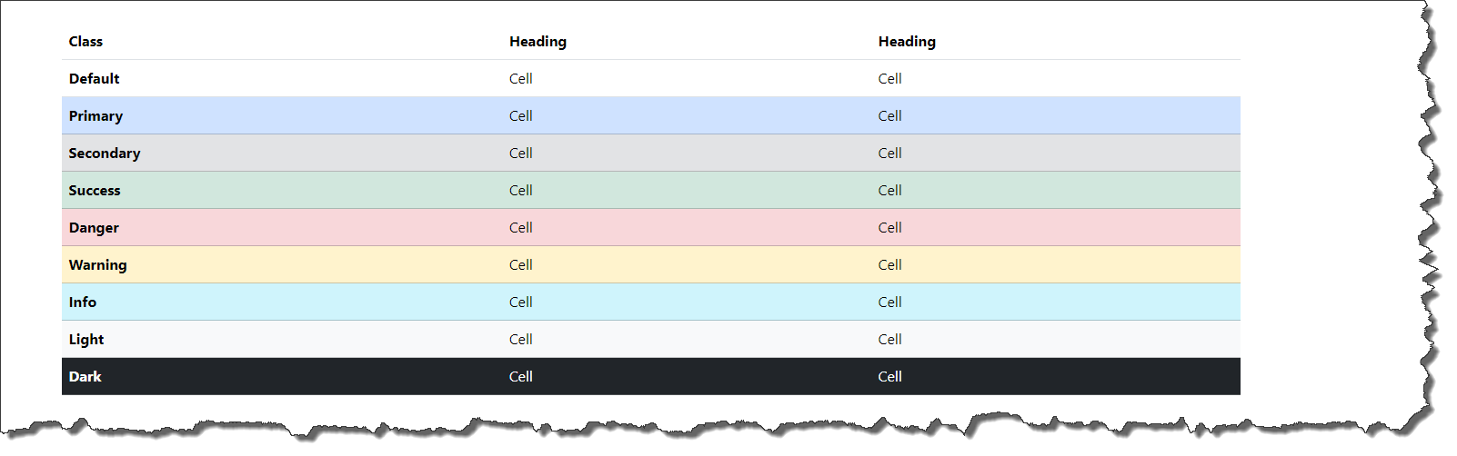
Bootstrap table variant
-
Documentation URL : https://getbootstrap.com/docs/5.3/content/tables/#variants
-
Code Snippet :
<table class="table">
        <thead>
        <tr>
            <th>Class</th>
            <th>Heading</th>
            <th>Heading</th>
        </tr>
        </thead>
        <tbody>
        <tr>
            <th>Default</th>
            <td>Cell</td>
            <td>Cell</td>
        </tr>

        <tr class="table-primary">
            <th>Primary</th>
            <td>Cell</td>
            <td>Cell</td>
        </tr>
        <tr class="table-secondary">
            <th>Secondary</th>
            <td>Cell</td>
            <td>Cell</td>
        </tr>
        <tr class="table-success">
            <th>Success</th>
            <td>Cell</td>
            <td>Cell</td>
        </tr>
        <tr class="table-danger">
            <th>Danger</th>
            <td>Cell</td>
            <td>Cell</td>
        </tr>
        <tr class="table-warning">
            <th>Warning</th>
            <td>Cell</td>
            <td>Cell</td>
        </tr>
        <tr class="table-info">
            <th>Info</th>
            <td>Cell</td>
            <td>Cell</td>
        </tr>
        <tr class="table-light">
            <th>Light</th>
            <td>Cell</td>
            <td>Cell</td>
        </tr>
        <tr class="table-dark">
            <th>Dark</th>
            <td>Cell</td>
            <td>Cell</td>
        </tr>
        </tbody>
</table>-
Here
-
table-primary
-
table-secondary
-
table-danger
-
table-warning
-
table-info
-
table-dark
-
table-light
-
-
Output :
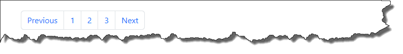
Bootstrap simple pagination
-
Documentation URL : https://getbootstrap.com/docs/5.3/components/pagination/#overview
-
Code Snippet :
<ul class="pagination">
    <li class="page-item"><a class="page-link" href="#">Previous</a></li>
    <li class="page-item"><a class="page-link" href="#">1</a></li>
    <li class="page-item"><a class="page-link" href="#">2</a></li>
    <li class="page-item"><a class="page-link" href="#">3</a></li>
    <li class="page-item"><a class="page-link" href="#">Next</a></li>
</ul>-
Here
-
pagination : Pagination base class
-
page-item : User for item
-
page-link : Use for link
-
-
Output :
Bootstrap table pagination with icons
-
Documentation URL : https://getbootstrap.com/docs/5.3/components/pagination/#working-with-icons
-
Code Snippet :
<ul class="pagination">
<li class="page-item">
<a class="page-link" href="#">
<span>«</span>
</a>
</li>
<li class="page-item"><a class="page-link" href="#">1</a></li>
<li class="page-item"><a class="page-link" href="#">2</a></li>
<li class="page-item"><a class="page-link" href="#">3</a></li>
<li class="page-item">
<a class="page-link" href="#">
<span>»</span>
</a>
</li>
</ul>-
Output :
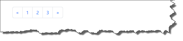
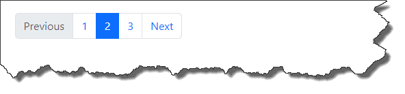
Bootstrap pagination disabled and active states
-
Documentation URL : https://getbootstrap.com/docs/5.3/components/pagination/#disabled-and-active-states
-
Code Snippet :
<ul class="pagination">
    <li class="page-item disabled">
        <a class="page-link">Previous</a>
    </li>
    <li class="page-item"><a class="page-link" href="#">1</a></li>
    <li class="page-item active" aria-current="page">
        <a class="page-link" href="#">2</a>
    </li>
    <li class="page-item"><a class="page-link" href="#">3</a></li>
    <li class="page-item">
        <a class="page-link" href="#">Next</a>
    </li>
</ul>-
Here
-
page-item disabled : Disable the item
-
active : Active item
-
-
Output :
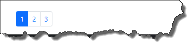
Bootstrap pagination sizing
-
Documentation URL : https://getbootstrap.com/docs/5.3/components/pagination/#sizing
-
Code Snippet :
<ul class="pagination pagination-sm">
    <li class="page-item active" aria-current="page">
        <span class="page-link">1</span>
    </li>
    <li class="page-item"><a class="page-link" href="#">2</a></li>
    <li class="page-item"><a class="page-link" href="#">3</a></li>
</ul>-
Here
-
pagination-sm : For small pagination
-
pagination-lg : For large pagination
-
-
Output :