CSS Flex or FlexBox
Flexbox, or Flexible Box Layout, is a CSS layout model that provides a more efficient way to design and manage the layout, alignment, and distribution of elements within a container. It’s particularly useful for building responsive and complex layouts without relying heavily on floats or positioning.
CSS Key Aspects of Flexbox
Flexbox is very important property for modern web design, it mostly helps to easy & responsive design. Let’s try to understand the key aspects of flexbox.
Flex Container (display: flex;)
-
display: flex;converts an element into a flex container. -
The container’s direct children become flex items.
-
The flex container establishes a flex formatting context, allowing the use of flexbox properties
Flex Items
-
The child elements of a flex container are known as flex items.
-
These items are laid out along a flex container’s main axis and cross axis.
-
They can be rearranged, aligned, and sized within the container using flex properties.
Flexible Sizing
-
Flexbox allows flex items to dynamically resize based on available space, distributing it among the items.
-
flex-grow,flex-shrink, andflex-basiscontrol how flex items grow, shrink, and size themselves.
Alignment and Distribution
-
Flexbox provides properties like
justify-contentandalign-itemsto align and distribute items along the main and cross axes.
CSS Flex Main Axis and Cross Axis
In Flexbox, the main axis and cross axis are two perpendicular axes that define the layout direction and alignment of flex items within a flex container.
Understanding and manipulating the main axis and cross axis is crucial in Flexbox, as they dictate the flow and alignment of flex items within a flex container. Adjusting properties related to these axes allows precise control over the layout and positioning of elements in a flexible and responsive manner.
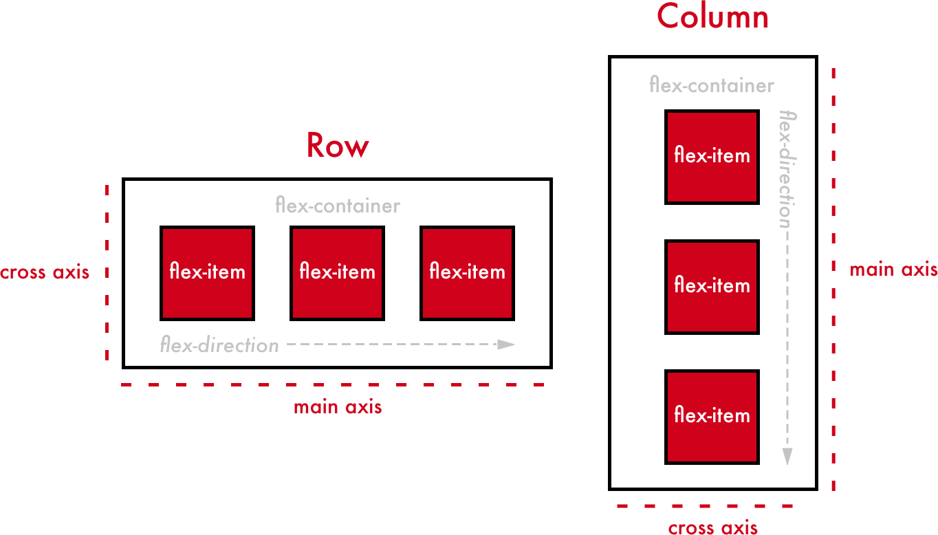
Main Axis
-
Direction :
-
Determined by the
flex-directionproperty. -
The primary axis along which flex items are laid out.
-
Horizontal (
roworrow-reverse) -
Vertical (
columnorcolumn-reverse)
-
-
Alignment :
-
Controlled by
justify-content. -
Defines how flex items are aligned along the main axis.
-
Options include
flex-start,flex-end,center,space-between,space-around,space-evenly.
-
Cross Axis
-
Perpendicular to the Main Axis :
-
Positioned perpendicular to the main axis within the flex container.
-
Vertical if the main axis is horizontal and vice versa.
-
-
Alignment :
-
Controlled by
align-items. -
Determines how flex items are aligned along the cross axis.
-
Values include
flex-start,flex-end,center,baseline,stretch.
-