CSS Flex or FlexBox Container
A Flexbox container, also known as a Flex Container, is an HTML element that has been styled with CSS properties to utilize Flexbox layout. This styling turns the element and its direct children into a flexible layout structure.
Flex Container properties
For control flex container, it uses various properties, in this section will list them all with example
-
display :
-
Values:
flex,inline-flex. -
Defines the element as a flex container.
-
flexcreates a block-level container. -
inline-flexcreates an inline-level container.
-
-
flex-direction :
-
Values:
row,row-reverse,column,column-reverse. -
Sets the direction of the main axis of the flex container.
-
-
flex-wrap :
-
Values:
nowrap,wrap,wrap-reverse. -
Controls whether flex items are forced onto a single line or can wrap onto multiple lines.
-
-
justify-content :
-
Values:
flex-start,flex-end,center,space-between,space-around,space-evenly -
Aligns flex items along the main axis of the flex container.
-
-
align-items :
-
Values:
flex-start,flex-end,center,baseline,stretch. -
Aligns flex items along the cross axis of the flex container.
-
-
align-content :
-
Values:
flex-start,flex-end,center,space-between,space-around,stretch. -
Defines how multiple lines of flex items are aligned in the cross-axis when wrapping occurs.
-
Flex Display
The display property in CSS is used to define the type of box used for an HTML element. In the context of Flexbox, the display property is crucial for creating Flex Containers and Flex Items.
Create a Flex Container display: flex;
-
display: flex;transforms the element into a block-level Flex Container. -
The element becomes a container for Flex Items, establishing a Flexbox layout context.
-
Its direct children become Flex Items.
Example
.flex-container {
  display: flex;
  /* Other Flexbox properties here */
}
Create an Inline Flex Container display: inline-flex;
-
display: inline-flex;creates an inline-level Flex Container. -
Similar to
display: flex;, but the container behaves like an inline-level element. -
It allows other elements to sit alongside it horizontally on the same line.
Example
.inline-flex-container {
  display: inline-flex;
  /* Other Flexbox properties here */
}
Flex Direction
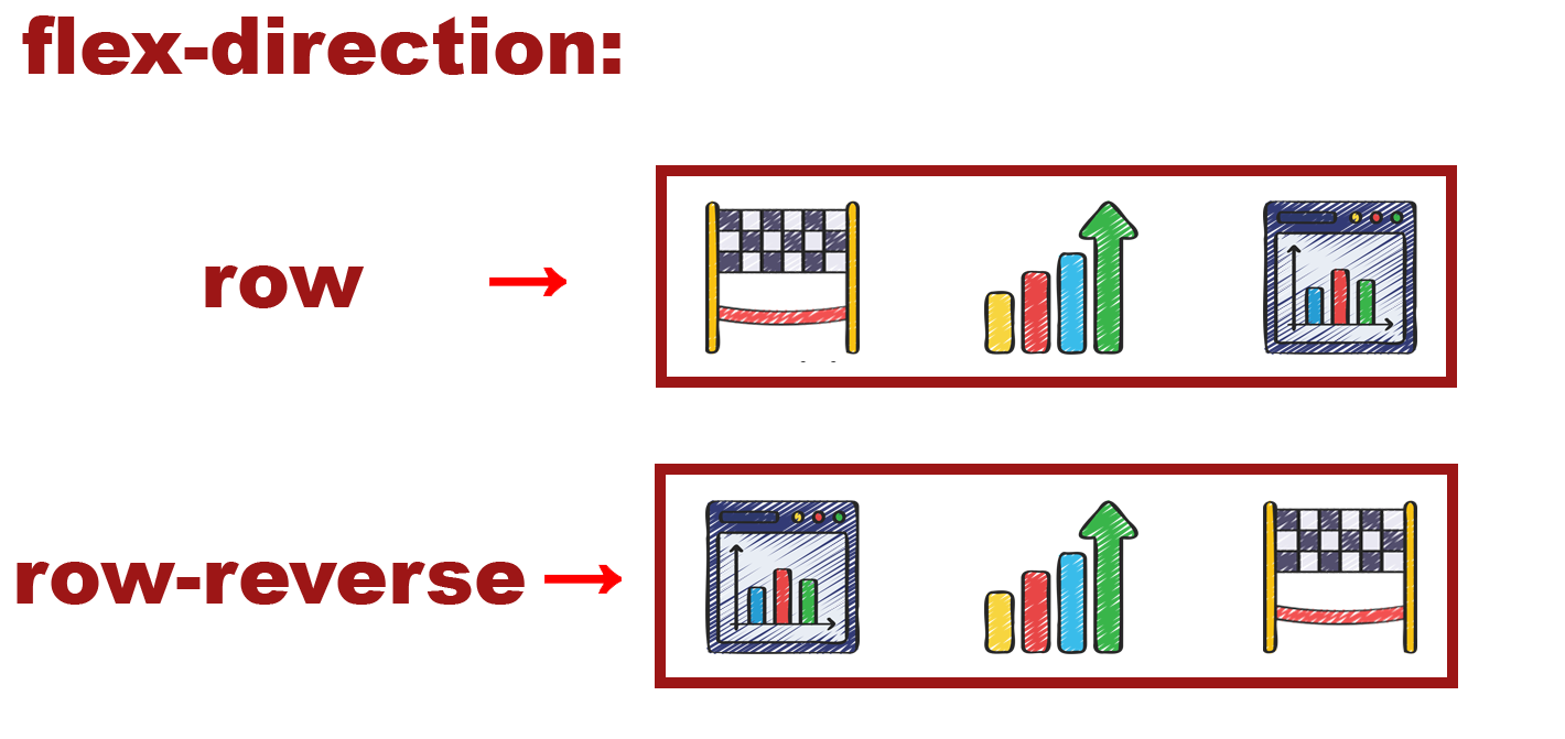
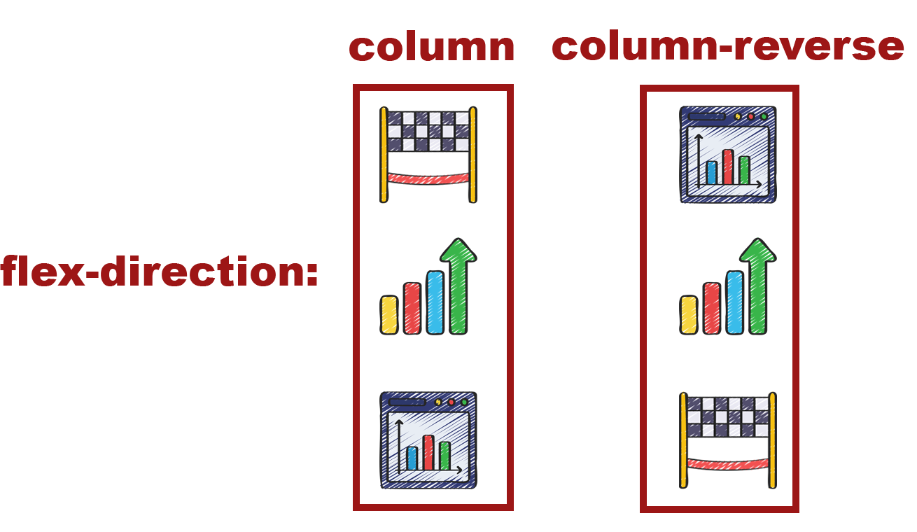
The flex-direction property in CSS Flexbox determines the direction of the main axis along which Flex Items are laid out within a Flex Container. It defines whether the items are arranged horizontally or vertically within the container.
Values for flex-direction:
-
row (default) :
-
Arranges Flex Items horizontally along the main axis from left to right.
-
Main axis is in the inline direction.
-
-
row-reverse :
-
Places Flex Items horizontally along the main axis from right to left.
-
Reverses the order of items compared to row.
-
-
column :
-
Positions Flex Items vertically along the main axis from top to bottom.
-
Main axis is in the block direction.
-
-
column-reverse :
-
Aligns Flex Items vertically along the main axis from bottom to top.
-
Reverses the order of items compared to column.
-
Example
.container {
  display: flex;
  flex-direction: row; /* or column, row-reverse, column-reverse */
}
Flex Wrap
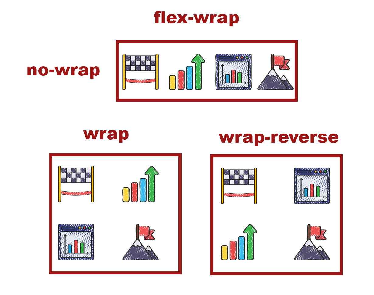
The flex-wrap property in CSS Flexbox defines whether the Flex Items within a Flex Container should wrap onto multiple lines or stay within a single line along the main axis when there’s not enough space to accommodate them.
Values for flex-wrap:
-
nowrap (default) :
-
Flex Items stay within a single line and may overflow the container if there’s insufficient space.
-
No wrapping occurs, and items are forced into a single line.
-
-
wrap :
-
Flex Items wrap onto multiple lines if necessary when the container’s width is insufficient to hold all items.
-
Items move onto the next line along the cross axis when they cannot fit on the current line.
-
-
wrap-reverse :
-
Similar to
wrap, but the wrapping occurs in the reverse direction. -
Flex Items wrap onto multiple lines in the opposite direction, starting from the end of the container.
-
Example
.container {
  display: flex;
  flex-wrap: wrap; /* or nowrap, wrap-reverse */
}
Flex Justify Content
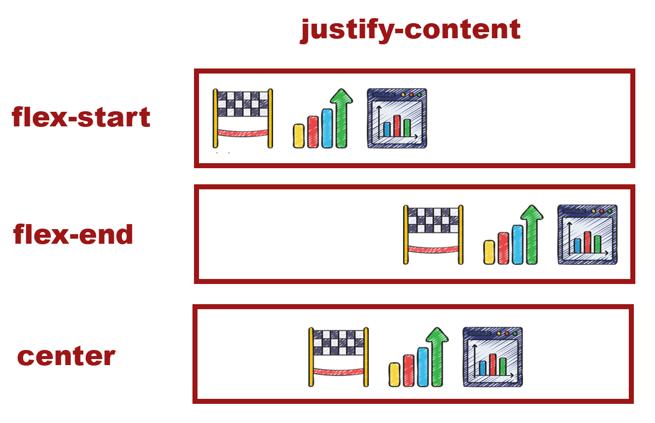
The justify-content property in CSS Flexbox is used to align Flex Items along the main axis within a Flex Container. It determines how extra space or insufficient space is distributed among the Flex Items.
Values for justify-content:
-
flex-start :
-
Flex Items are packed at the start of the main axis.
-
Items are aligned towards the beginning of the container.
-
-
flex-end :
-
Flex Items are packed at the end of the main axis.
-
Items are aligned towards the end of the container.
-
-
center :
-
Flex Items are centered along the main axis.
-
Items are evenly distributed with equal space before the first item and after the last item.
-
-
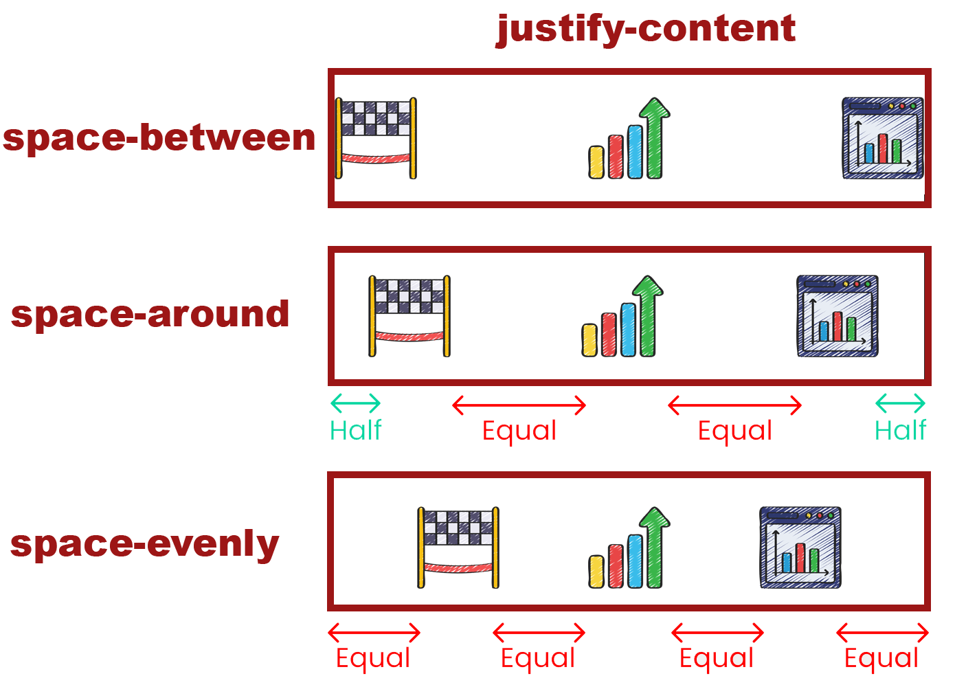
space-between :
-
Flex Items are evenly distributed along the main axis.
-
The first item is at the start, the last item is at the end, and the remaining space is distributed between items.
-
-
space-around :
-
Flex Items are evenly distributed along the main axis with space around them.
-
Space is distributed around items, giving them equal space on both sides.
-
-
space-evenly :
-
Flex Items are evenly distributed along the main axis with equal space around them.
-
Items have equal space before, between, and after them.
-
Example
.container {
  display: flex;
  justify-content: space-between; /* or flex-start, flex-end, center, space-around, space-evenly */
}
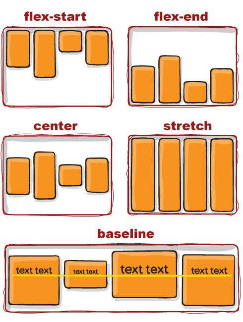
Flex Align Items
The align-items property in CSS Flexbox is used to align Flex Items along the cross axis within a Flex Container. It defines how items are positioned perpendicular to the main axis.
Values for align-items:
-
stretch (default) :
-
Stretches Flex Items to fill the container along the cross axis.
-
Items are stretched to match the container’s height or width depending on the axis.
-
-
flex-start :
-
Aligns Flex Items at the start of the cross axis.
-
Items are aligned towards the start of the container.
-
-
flex-end :
-
Aligns Flex Items at the end of the cross axis.
-
Items are aligned towards the end of the container.
-
-
center :
-
Aligns Flex Items at the center of the cross axis.
-
Items are vertically centered within the container.
-
-
baseline :
-
Aligns Flex Items along their baselines.
-
The baseline is the imaginary line where the text sits.
-
Example
.container {
  display: flex;
  align-items: center; /* or flex-start, flex-end, baseline, stretch */
}
Flex Align Content
The align-content property in CSS Flexbox is used to control the alignment of flex lines within a flex container when there’s extra space in the cross axis (when wrapping is enabled).
Values for align-content:
-
stretch (default) :
-
Stretches flex lines to fill the container’s cross axis.
-
Flex lines are stretched to match the container’s height or width depending on the axis.
-
-
flex-start :
-
Aligns flex lines at the start of the container’s cross axis.
-
Places the flex lines towards the start of the container.
-
-
flex-end :
-
Aligns flex lines at the end of the container’s cross axis.
-
Positions the flex lines towards the end of the container.
-
-
center :
-
Centers flex lines along the cross axis of the container.
-
Places the flex lines at the center of the container.
-
-
space-between :
-
Distributes space evenly between flex lines.
-
The first line is at the start of the cross axis, the last line at the end, and the remaining space is evenly distributed between lines.
-
-
space-around :
-
Distributes space evenly around flex lines.
-
Space is allocated around each line, providing equal space before the first line and after the last line, as well as between lines.
-
-
space-evenly :
-
Distributes space evenly between and around flex lines.
-
Provides equal space between lines and around the container edges.
-
Example
.container {
  display: flex;
  flex-wrap: wrap;
  align-content: space-around; /* or flex-start, flex-end, center, space-between, space-evenly, stretch */
}
Flex Gap Property
The gap property in CSS is used to create space between grid or flex items. When it comes to Flexbox, there isn’t a specific flex-gap property, but the gap property works with flex containers as well as grid containers.
Details of Flex Gap Property
-
gap : (Shorthand): Sets both row and column gaps in a flex container.
-
row-gap : Sets the gap between rows in a flex container.
-
column-gap : Sets the gap between columns in a flex container.
Example
.container {
  display: flex;
  gap: 20px; /* Sets both row and column gap to 20px */
}