HTML Form Details
A web form or HTML form on a web page allows a user to enter data that is sent to a server for processing.
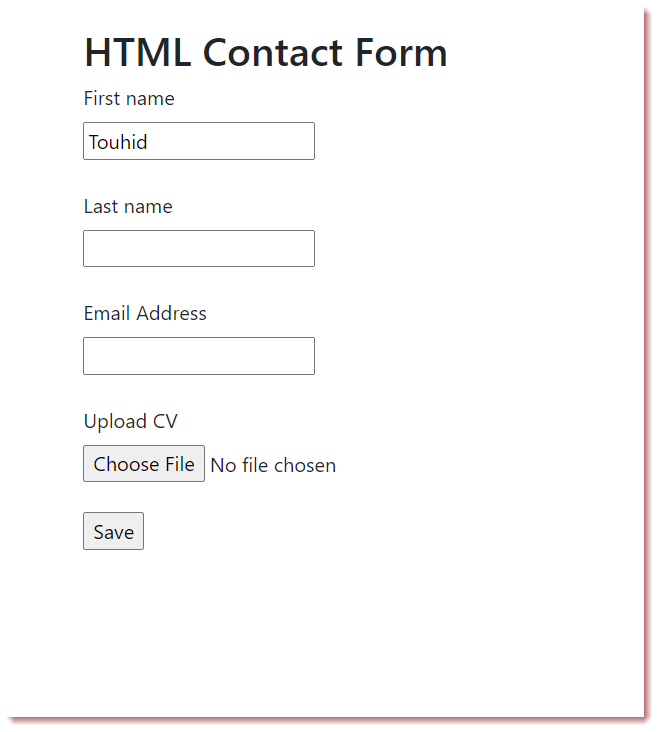
Example form
    <form action="submit-to-url" method="post" enctype="multipart/form-data">

        <label for="first-name">First name</label><br>
        <input type="text" id="first-name" name="firstName" value="Touhid">
        <br><br>

        <label for="last-name">Last name</label><br>
        <input type="text" id="last-name" name="lastName">
        <br><br>

        <label for="email-address">Email Address</label><br>
        <input type="email" id="email-address" name="email" required>
        <br><br>

        <label for="cv">Upload CV</label><br>
        <input type="file" id="cv" name="cv">
        <br><br>

        <input type="submit" value="Save">
    </form>
output
Form tag all attributes
Below listing the form all important attributes
-
action : Form submission destination
-
method : Data type sending mechanism
-
get : Appends form-data into the URL in name/value pairs, max 3000 characters allowed.
-
post : Appends form-data inside the body of the HTTP request
-
-
enctype : From data encoding type.
-
application/x-www-form-urlencoded : Default. All characters are encoded before sent
-
multipart/form-data : User for file type input
-
text/plain : Sends data without any encoding
-
-
name : Specifies the name of a form
-
target : Submission display
-
_blank : The response is displayed in a new window or tab.
-
_self : Default. The response is displayed in the same window.
-
_parent : The response is displayed in the parent window.
-
_top : The response is displayed in the full body of the window.
-
framename : The response is displayed in a named iframe.
-
-
autocomplete : Specifies whether a form should have autocomplete on or off.
-
on
-
off
-
-
novalidate : Specifies that the form should not be validated when submitted
-
novalidate
-
-
accept-charset : Specifies the character encodings that are to be used for the form submission.
-
UTF-8 : Default. Character encoding for Unicode
-
Common attributes for inputs
-
autocomplete : Hint for form autofill feature
-
autofocus : Automatically focus the form control when the page is loaded
-
disabled : Whether the form control is disabled
-
form : Associates the control with a form element
-
name : Name of the form control.
-
readonly : Boolean. The value is not editable
-
required : Boolean. A value is required or must be check for the form to be submittable
-
type : Type of form control
-
value : The initial value of the control.
Input type attribute values
-
type : Behavior of an input
-
button : Rendered as simple push buttons
-
checkbox : Rendered by default as boxes that are checked (ticked) when activated
-
color : User interface element that lets a user specify a color
-
date : Create input fields that let the user enter a date
-
datetime-local : Create input controls that let the user easily enter both a date and a time
-
email : Used to let the user enter and edit an e-mail address
-
file : User choose one or more files from their device storage.
-
hidden : Let web developers include data that cannot be seen or modified by users
-
image : Used to create graphical submit buttons
-
month : Let the user enter a month and year allowing a month and year to be easily entered.
-
number : Let the user enter a number.
-
password : Provide a way for the user to securely enter a password.
-
radio : Radio buttons are typically rendered as small circles, which are filled or highlighted when selected.
-
range : Let the user specify a numeric value which must be no less than a given value, and no more than another given value.
-
reset : Rendered as buttons
-
search : Text fields designed for the user to enter search queries into.
-
submit : Rendered as buttons.
-
tel : Let the user enter and edit a telephone number.
-
text : Create basic single-line text fields.
-
time : Let the user easily enter a time
-
url : Let the user enter and edit a URL.
-
week : Allowing easy entry of a year plus the ISO 8601 week number.
-
<label>Name of the Label</label>
Used for add label of inputs or textarea or select.
<textarea></textarea>
Represents a multi-line plain-text editing control
<select></select>
Represents a control that provides a menu of options
text
Provides a single-line text input field.
Codes
<input type="text" name="firstName" value="Touhid">Output
Collects and validates email addresses.
Codes
<input type="email" id="email" pattern=".+@hmtmcse\.com" size="30" required>Output
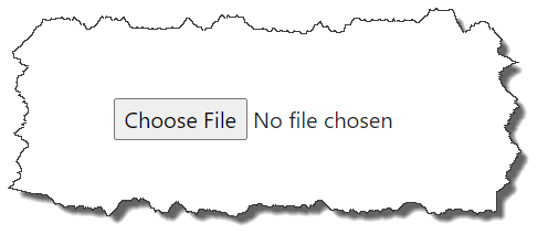
file
Enables file uploads.
Codes
<input type="file" id="cv" name="cv">Output
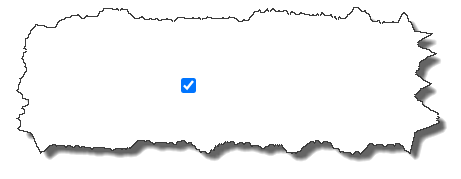
checkbox
Allows users to select one or multiple options.
Codes
<input type="checkbox" id="scales" name="scales" checked>Output
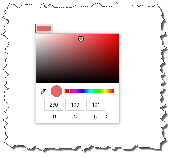
color
Allows selection of a color.
Codes
<input type="color" id="head" name="head" value="#e66465">Output
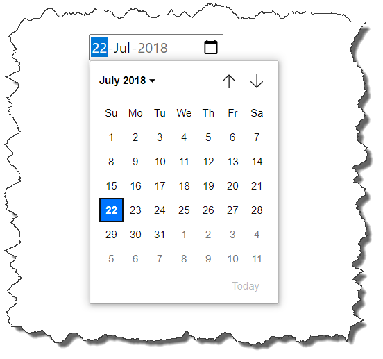
date
Allows selection of a date.
Codes
<input type="date" id="start" name="trip-start" value="2018-07-22" min="2018-01-01" max="2018-12-31">Output
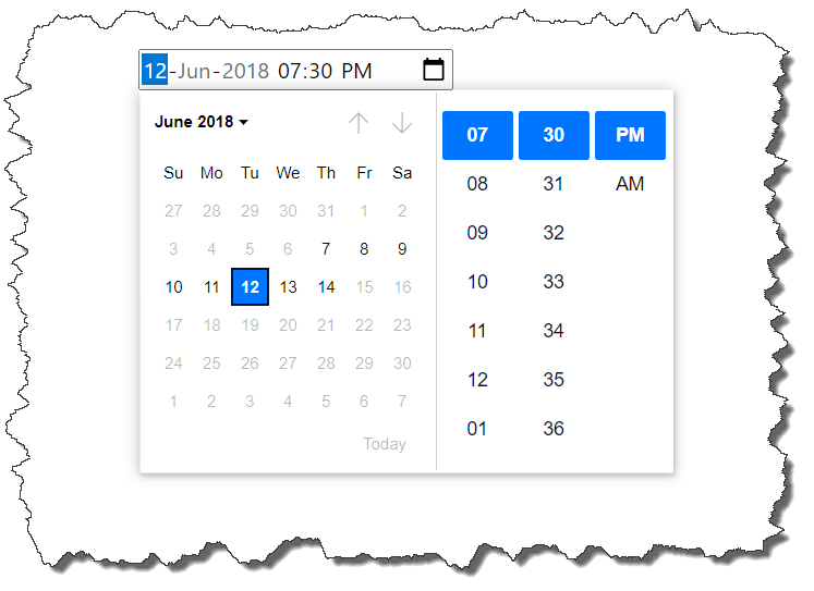
datetime-local
Provides a user-friendly interface with a combined date and time picker
Codes
<input type="datetime-local" id="meeting-time" name="meeting-time" value="2018-06-12T19:30" min="2018-06-07T00:00" max="2018-06-14T00:00">Output
hidden
It is not visible to users but can still hold and submit data when the form is submitted.
Codes
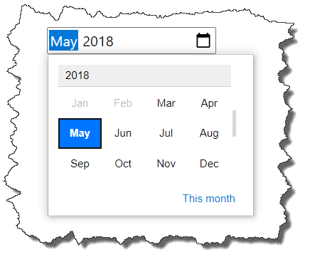
<input id="id" name="id" type="hidden" value="12">month
Codes
<input type="month" id="month-only" name="start" min="2018-03" value="2018-05">Output
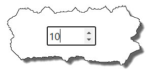
number
Accepts numeric input.
Codes
<input type="number" id="tentacles" name="tentacles" min="10" max="100">Output
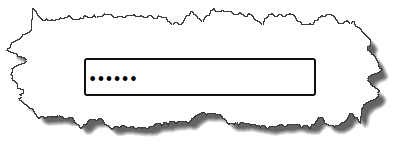
password
Hides the input characters, typically used for sensitive data like passwords.
Codes
<input type="password" id="pass" name="password" minlength="8" required>Output
radio
Allows users to select a single option from multiple choices.
Codes
<input type="radio" id="dewey" name="drone" value="dewey">Output
range
Provides a slider control for selecting a value within a specified range.
Codes
<input type="range" id="volume" name="volume" min="0" max="11">Output
search
Enhances input for search fields.
Codes
<input type="search" id="site-search" name="q">Output
tel
Codes
<input type="tel" id="phone" name="phone" pattern="[0-9]{3}-[0-9]{3}-[0-9]{4}" required>Output
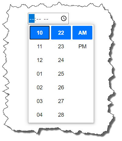
time
Codes
<input type="time" id="appt" name="appt" min="09:00" max="18:00" required>Output
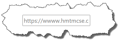
url
Codes
<input type="url" name="url" id="url" placeholder="https://wwww.hmtmcse.com" pattern="https://.*" required>Output
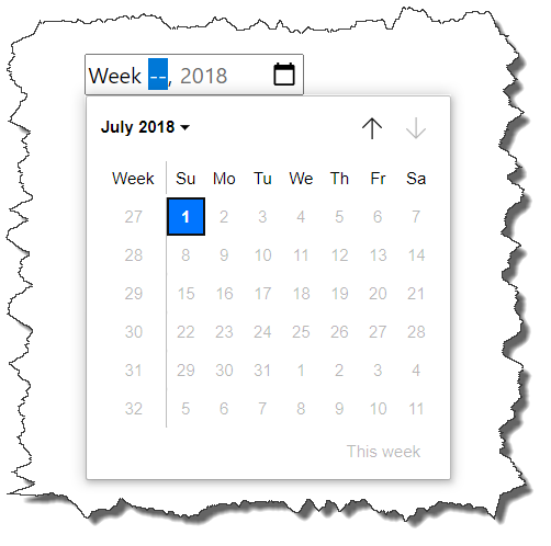
week
Codes
<input type="week" name="week" id="camp-week" min="2018-W18" max="2018-W26" required>Output
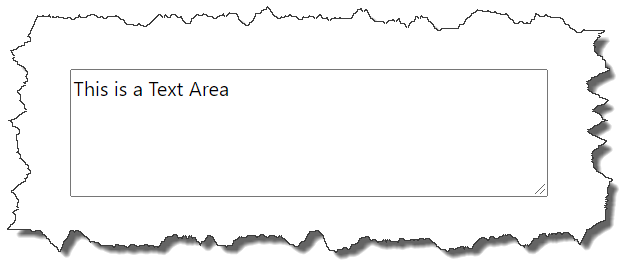
textarea
Codes
<textarea id="textarea" name="example" rows="4" cols="50">This is a Text Area</textarea>Output
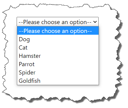
select
Codes
<select name="pets" id="pet-select">
    <option value="">--Please choose an option--</option>
    <option value="dog">Dog</option>
    <option value="cat">Cat</option>
    <option value="hamster">Hamster</option>
    <option value="parrot">Parrot</option>
    <option value="spider">Spider</option>
    <option value="goldfish">Goldfish</option>
</select>
Output
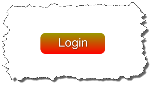
image
Codes
<input type="image" id="image" alt="Login" src="https://hmtmcse.com/static-files/wb/html/login-button.png">Output
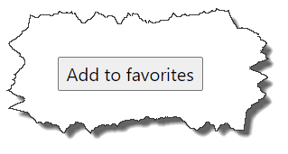
button
Codes
<input class="favorite styled" type="button" value="Add to favorites">Output
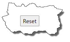
reset
Resets the form to its initial state.
Codes
<input type="reset" value="Reset">Output
submit
Submits a form.
Codes
<input type="submit" value="Save">Output